REVIEW: Batman Odyssey #1 by Neal Adams
I should start off by admitting that I love Neal Adams artwork. This guy is a MASTER! An absolute master artist. He helped redefine the look of comics in the 1970s and he can still draw just about anybody under the table. Okay, with my disclaimer out of the way I can get on with the review…

I did not intend to pick up Batman: Odyssey #1 by Neal Adams. I harbored no ill feelings toward the book, I’m just trying to minimize my current comic book expense. Well, when I saw the book on the shelf I couldn’t help but sneak a peek. After seeing one or two panels of Neal Adams’ gorgeous artwork, the comic found its way to my “buy” pile.
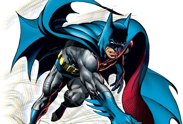
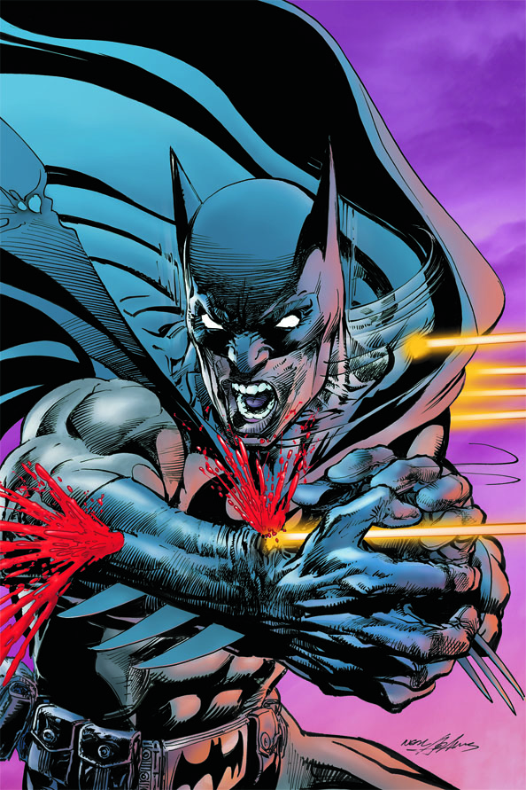
Without a doubt, Adams is still a visual storytelling genius. His Batman is… to put it simply, his Batman IS Batman. The characters faces and expressions are dead-on. Each page is chockfull of details, each gadget is intricate and fascinating, each panel completed to their fullest. His sense of motion, perspective, and action are breathtaking. This comic is what all comics should look like. Using creative panel grids rarely seen in comics today, he’s able to effortlessly transition from eight-panel pages to two-page splash panels. Just amazing stuff.
The story starts off with a flashback to the early days of Batman. Adams does a great job showing how Batman’s early costume was unsophisticated and a far cry from the costume of today. The proto-Batman has a loose-fitting cowl and floppy ears. Nice job by Adams making him immediately distinguishable from today’s Batman.

That covers the art. Now, about the story…
While I was blown away by the art in this book, I found myself disappointed in the story. I re-read the comic a day or two later hoping for a different impression. It was definitely better upon second reading, but overall was still not what I was expecting.
The dialogue in the book didn’t feel like a modern Batman tale. Perhaps this was how Batman was written in the 1970s, I really don’t know. Regardless, it didn’t “feel” like Batman talking and thinking. I’m not really sure what to make of the plot at this point. The first half of the book is taken up with the flashback, followed up with some odd Man-Bat scenes, and finally Batman & Robin arriving at the Gotham Pier in hopes of foiling the Riddler’s heist. All of these elements seem completely unrelated, but perhaps it’ll come together in later issues.
In the flashback, Batman sports two .45 automatic pistols used to shoot villain’s guns from their hands. I believe this directly contradicts Batman: Year One and Batman: Year Two. Don’t hold me to that as I haven’t read either story in a long time, but at the very least it contradicts the spirit of those books. Adding contradictory elements to characters origins worked fine in the 1970s when continuity wasn’t as important, but nowadays that is difficult as readers have become more particular.
Next is a straight-up artistic goof. In the issue, Batman spends quite a bit of time with Robin (Dick Grayson). For whatever reason, Adams has drawn Grayson’s Robin in the costume of Tim Drake’s Robin. This would be the costume Tim wore from 1989 to 2005. Don’t get me wrong, Adams draws a beautiful rendition of Tim’s uniform, it’s just confusing because it’s Dick wearing the costume.
The disappointing writing really hurt the success of this comic in my eyes. I believe if Adams had asked Denny O’Neil (or another accomplished writer) to draft the script, the story could have been a potential home run. Alternatively, if they slapped an “Elseworlds” logo on the front it would have made the story more palatable. The “Sneak Peek” artwork hints that a child will be injured or killed in a future issue. Having just gone through that emotional sucker-punch with Justice League: Cry for Justice and the Rise of Arsenal, I’d prefer not see children exploited again in comics for shock value.
Due to the disappointing writing in the first issue, it’s unlikely I’ll be picking up the second issue. If they were to publish an art book featuring selected artwork from this series, I would definitely be interested in that.

My reaction exactly. I simply couldn’t see the point of this title. Issue one is heading off to the charity shop and issue two has been scratched off my pull-list. Yes, it looked nice, but that’s simply not enough.
One of my early comics was a Power Record featuring a Neal Adams Man-Bat story, and I loved the guy enough to have bought entirely too many poorly written Continuity Comics. That said, Jim Aparo will always be my definitive Batman artist, and this unbranded Elseworld isn’t my speed.
Well, first off, it’s not terribly fair to judge anything when it’s only the first issue, and it’s even more unusual to dismiss a series with more fantastic art to come. But there ARE two things, without reading further issues, that are obvious enough. Those two things being: 1.The altered Batman costume and 2.the Tim Drake outfit. There is no rational reason to take Tim’s unique visual characteristic and suddenly super impose it onto the legendary Robin. Initially, it was very natural for all readers to assume that it was TimDrake we were looking at but the typo of Dicks name kept showing up, lol. It’s clear that Neal took the Drake costume he invented and is trying to erase the classical Robin, which is really not right. As for Batman’s costume, it’s a shame that Neal doesn’t preserve his legacy of the Batman he made immortal- Burning omen of the fierce yellow moon, sleek compact hi-tech belt and demon ghost white eyes. In this strange alternate costume he robs us of the Yellow omen, changes the belt to blue, and shows us the eye pupils are visible when in close range. So without being too hasty on the series, these two facts remain undeniable (Tim Drake costume+Batman’s tailor alteration).
At this point, this is written at issue#3, and what EVERYONE seems to not have noticed at all is that the FIRST issue was suppose to be all about technology and gadgets- the SECOND issue is suppose to be all about the grit and toughness of mortal challenge, basically things like a dislocated shoulder, broken ulna, pressing a ton, running a a marathon, broken ribs, etc. It shows how tough Batman is- the THIRD issue was about Batman’s incomparable prowess as a lethal ninja master of the martial arts reaching supernatural skills to take out 50 opponents, so essentially Mortal Combat (Action Action!). So basically, Adams features each of the major aspects that defines the character with a whole issue for each as room for focus.
As issue one shows all his genius gadgets that he invents and issue two shows all his toughness, most peoples favorite (as mine) will be the one that shows his supernatural Mortal Combat (Bruce Lee stuff). It seems that how each issue focus’s on each of Batmans defining aspects is totally missed by EVERYONE, which is weird. However despite each feature, what remains constant throughout every issue and is always present is the Worlds Greatest Detective aspect. So no matter which defining trait of Batman the months issue decides to showcase, his genius Detective skills worthy of Sherlock Holmes remains present for each story.
Unfortunately, despite all this impressive structure of story and design the dialogue hurts the whole project, and this is what disappoints most readers I think. Neal Adams, like every comic book artist, is an excellent story teller. That is why his story is so great and his plot is descent if not great. There is no comic book artist who cannot give you great stories and think of them, especially a pro like Adams. However, the words that come out of their mouths, or the dialogue (script), is an entirely different skill from story/plot. Making a script is like being able to give good speech’s and invent neat psychology of new characters or make familiar lines of old standing ones.
I feel that the script was very hard to follow, and mostly very immature, but who gives a sh*t. The art alone is worth it and the story is cool enough to follow to the end and in any case I have to commend Neal’s bravery for at least trying to take it all on. Originally, Frank Miller was suppose to script it for Neal, but Miller got cold feat (although honored) because of his recent All Stars train wreck. People don’t think too highly of Miller nowadays due to his two sucky films and his butchering of DC characters from All Stars and Strikes Again.
Maybe Odessey would have brought him back in good graces and save Neal’s well attempted project. All in all, we’re only a quarter in so we have more amazing comic book art to feast on and although the costume is false we can still see how Batman should always be drawn. No matter on the poor scripting, people will still flock to the shelves and buy the issue that is brought to us by the man who seems to be infuriating the field of geology, and by the man whom they all know invented the Batman.
Robinson and Kane discovered Batman, Neal Adams invented him, and Frank Miller exploited him. Odyssey shows some of that returning, if it were the real costumes it prolly would’ve showed a whole lot more.
Good luck to Neal, I’ll still be buying the whole series.