Once Upon a Geek has regenerated!
An update on some web site administration today. Some of you may have noticed that ONCE UPON A GEEK looks a little different today. The changes were cosmetically minor, so don’t feel bad if you didn’t see a difference. While the changes will seem minor to you, they are tremendous to me! Ever since I launched this blog, I despised the WordPress “theme” I was using. I didn’t like the fonts, the space available for posts, the blue and orange (not much of a Florida Gator fan myself), and some other things. I’ve been looking for a new WordPress theme for ages and finally stumbled across one I liked this past weekend! Hooray!
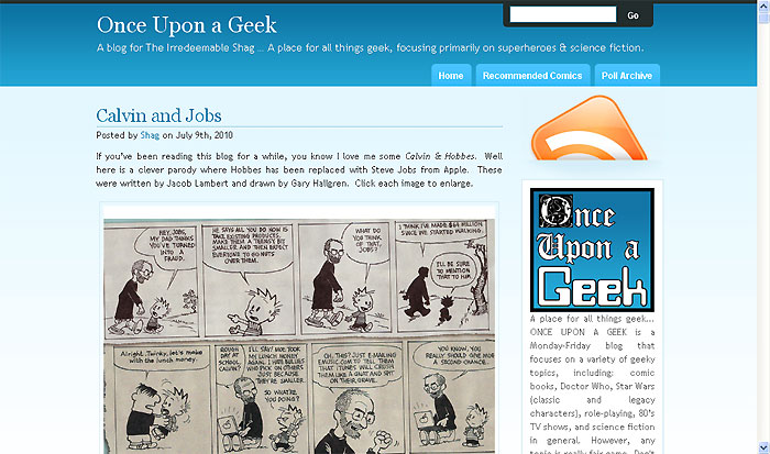
Below is a screen shot showing how ONCE UPON A GEEK looked previously. Notice the serif fonts, the blue and orange colors, the amount of wasted space in each margin, and the narrow width of the “Calvin and Jobs” image.

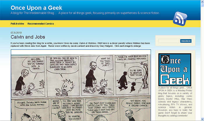
Below is a screen shot of that same post using the new WordPress theme. Notice the bold title ONCE UPON A GEEK, the lack of serif fonts, the blue and yellow contrast, the lack of wasted space in the margins, and most importantly the width of the “Calvin and Jobs” image. Up until now I’ve been restricted to displaying images at 525 pixels wide. This new theme will allow me to display images up to 700 pixels wide. The previous width was so small, many images just didn’t display well. I’m really looking forward to utilizing this new space!

I’ve had to make some adjustments to the new theme to get it just the way I want it. Also, some older posts might look awkward now since the width change. If you stumble across any issues with the new look and feel, please drop me a line. I’d appreciate the assistance.
As always, thanks for reading ONCE UPON A GEEK! Stay geeky!
